

1. What Is Perceptual Mapping / Positioning Map?
Perceptual Mapping—also called a Positioning Map—is a visual technique that displays how customers perceive competing brands, products, or concepts relative to one another along attributes that matter to them. Typically shown as a two-dimensional chart, it helps teams see “where we sit today,” “who we’re near and far from,” and “which spaces are crowded or open.”
This is a marketing strategy and research framework within Segmentation, Targeting, and Positioning (STP). It is widely used by consultants and in-house teams to guide positioning choices, messaging, product design, and portfolio management. The power of the tool comes from translating complex, often qualitative perceptions into a simple picture that aligns cross-functional stakeholders on market reality.
In plain language: a perceptual map is the quickest way to show how customers compare options in their heads. It makes relative differences and white spaces visible—so you can choose where to compete and how to differentiate.
2. Origin and Background
Origins: Perceptual mapping draws on statistical techniques from psychometrics—especially Multidimensional Scaling (MDS) and factor analysis—developed in the 1950s–1960s (notably by researchers such as Warren Torgerson and Joseph Kruskal). Marketing researchers adopted and popularized these techniques in the 1970s to visualize brand and product perceptions, with significant contributions from scholars like Paul Green and Yoram Wind. The broader idea of “positioning” in consumers’ minds was popularized around the same time by Al Ries and Jack Trout.
Why it was created: Managers needed a rigorous yet intuitive way to represent how customers perceive competing offerings—beyond tables of ratings or anecdotal quotes—so they could design differentiated positions and avoid “me-too” strategies.
Diffusion: The method became a staple in marketing research, business school curricula, and consulting practice. Today, it is applied using survey data, behavioral signals, or text analytics, and it remains a core artifact in brand and go-to-market strategy work.
3. How Perceptual Mapping / Positioning Map Works
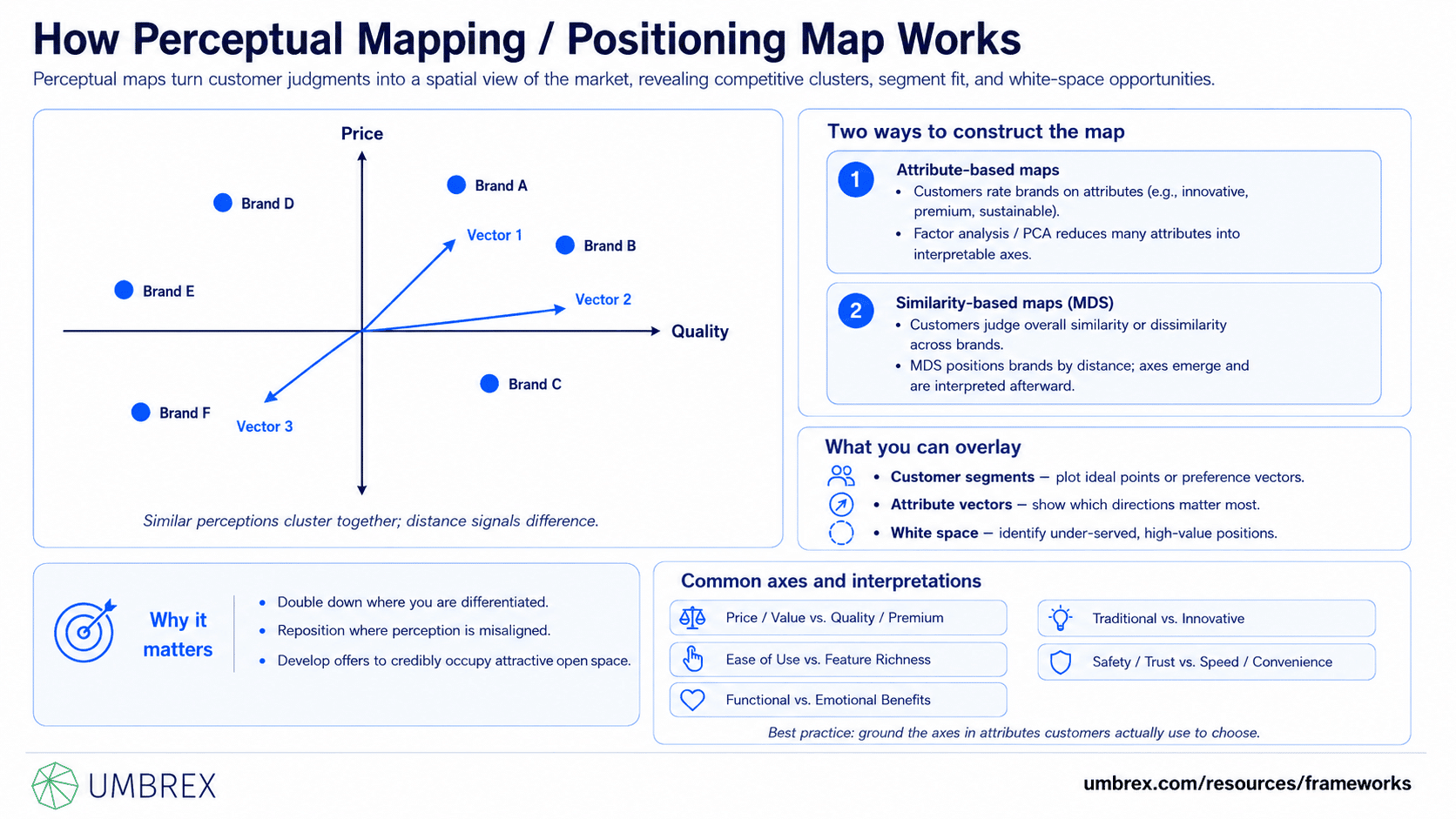
Perceptual mapping converts customer judgments into a spatial picture. Brands or concepts that are perceived similarly appear close together; those seen as different appear farther apart. There are two primary ways to construct a map:
- Attribute-based maps: Customers rate brands on specific attributes (e.g., “innovative,” “easy to use,” “premium,” “sustainable”). Data reduction methods (e.g., factor analysis or principal components) condense many attributes into two or three composite axes that explain the most variance. The result is a map with interpretable axes (e.g., “Value–Premium” on one axis; “Functional–Emotional” on the other).
- Similarity-based maps (MDS): Customers indicate how similar or dissimilar brands feel overall, without reference to specific attributes. MDS places brands in a space that best reflects those distances. Axes are emergent, not pre-labeled; teams infer their meaning by examining attribute loadings or by overlaying attribute vectors afterward.
In both cases, you can overlay additional elements:
- Customer segments: Plot “ideal points” or preference vectors for segments to see which positions resonate with whom.
- Attributes as vectors: Show which direction “premium,” “fast,” or “secure” pulls, and which brands load strongly on each attribute.
- White space: Identify under-served areas where few or no competitors currently sit but where customer demand exists.
The output is a heat map for competitive differentiation: it shows where to double down, where to reposition, and where to develop offers to credibly occupy an open, valued space.
Common Axes and Interpretations
- Price/Value vs. Quality/Premium: Useful in consumer goods and services to segment “value” plays vs. “premium” propositions.
- Ease of Use vs. Feature Richness: Common in software, signaling trade-offs between simplicity and capability.
- Functional vs. Emotional Benefits: Helpful in brand strategy to distinguish rational performance from emotive appeal.
- Traditional vs. Innovative: Often maps legacy incumbents vs. disruptors.
- Safety/Trust vs. Speed/Convenience: Relevant in financial services, healthcare, and marketplaces.
Note: these are illustrative. The most powerful maps are grounded in attributes your customers actually use to make choices, not what marketers wish were true.
4. When to Use Perceptual Mapping / Positioning Map
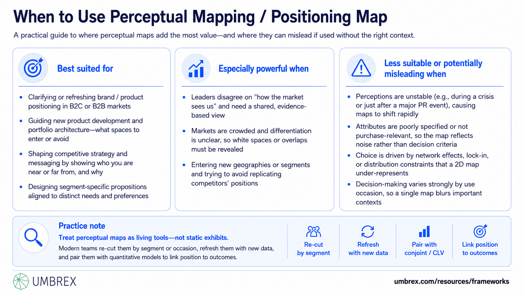
Best suited for:
- Companies (B2C or B2B) clarifying or refreshing brand/product positioning.
- New product development and portfolio architecture—deciding which spaces to enter or avoid.
- Competitive strategy and messaging—understanding who you’re near/far from and why.
- Segment-specific propositions—aligning positions with distinct needs and preferences.
Especially powerful when:
- Leaders disagree about “how the market sees us” and need a shared, evidence-based view.
- Markets are crowded and differentiation is unclear; you need to reveal white spaces or overlaps.
- You are entering new geographies or segments and want to avoid replicating competitors’ positions.
Less suitable or potentially misleading when:
- Customer perceptions are highly unstable (e.g., in a crisis or shortly after a major PR event); maps may shift week to week.
- Attributes are poorly specified or not purchase-relevant; you may map noise rather than decision criteria.
- Choices are driven by network effects, lock-in, or distribution constraints—factors a 2D perception map may under-represent.
- Decision-making is strongly multi-contextual (e.g., different use occasions with different trade-offs) and a single map blurs these contexts.
Practice note: Perceptual maps are still widely used, but modern teams treat them as living tools—re-cut by segment or occasion, refreshed with new data, and paired with quantitative models (e.g., conjoint, CLV) to link position to outcomes.
5. How to Apply Perceptual Mapping / Positioning Map: Step-by-Step
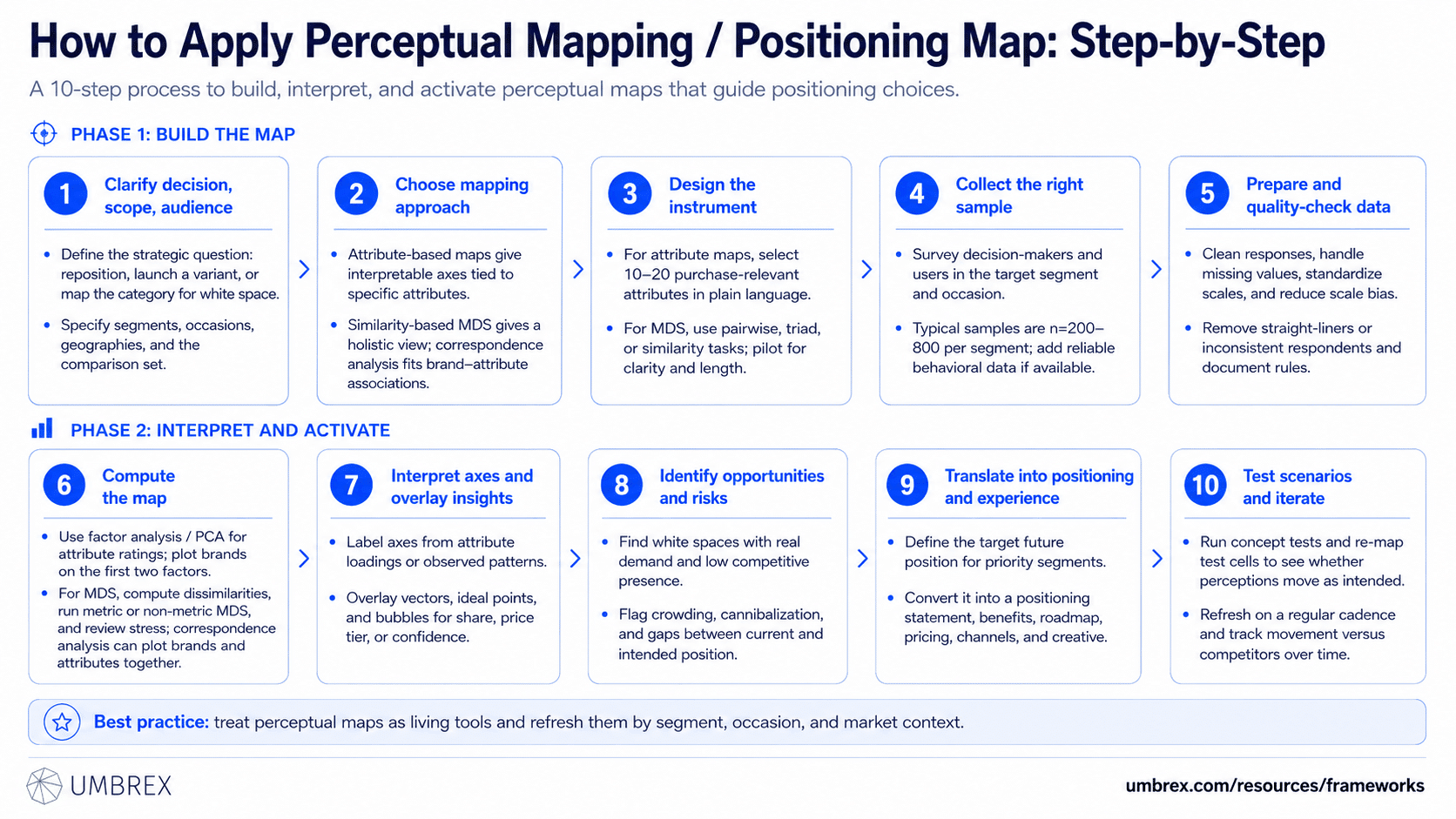
- Clarify the decision, scope, and audience.
Define the strategic question: repositioning an existing brand, launching a variant, or mapping a category to spot white space? Specify the customer segment(s), occasions, and geographies. Decide the comparison set: which brands or products must be on the map to reflect real choice?
- Choose the mapping approach.
Select attribute-based mapping if you want interpretable axes tied to specific attributes. Choose similarity-based MDS if you want a holistic view without pre-imposing attributes. For brand–attribute association data (e.g., “which brand fits which attribute?”), correspondence analysis can be effective.
- Design the instrument.
For attribute maps: select 10–20 attributes customers actually use to choose. Use plain language. Include importance ratings if you plan to overlay what matters most. For MDS: design pairwise or triad comparisons (or overall similarity ratings) that are practical for respondents. Pilot the survey to ensure comprehension and manageable length.
- Collect data from the right sample.
Target decision-makers and users in the defined segment/occasion. Typical sample sizes range from n=200–800 per segment for robust maps; smaller samples can work for directional insight. Consider augmenting with behavioral data (reviews, social listening, usage logs) if reliable and segmentable.
- Prepare and quality-check the data.
Clean responses, handle missing values, standardize scales, and remove straight-liners or inconsistent respondents. For attribute ratings, standardize by respondent to reduce scale bias. Document inclusion/exclusion rules.
- Compute the map.
For attribute ratings, use factor analysis or principal components to extract 2–3 factors; plot brand scores on the first two factors. For MDS, compute dissimilarities and run an MDS algorithm (metric or non-metric) to place brands in 2D; review stress values to assess fit. For correspondence analysis, plot brands and attributes in the same space.
- Interpret axes and overlay insights.
Label axes based on attribute loadings or observed patterns. Overlay attribute vectors to show directionality, and add “ideal points” or preference vectors by segment if you collected importance/preference data. Use bubble size or color to denote market share, price tier, or confidence.
- Identify opportunities and risks.
Spot white spaces with demonstrated demand (high importance, low brand presence). Flag crowding and cannibalization risks in your portfolio. Note mismatches between your current position and your intended value proposition.
- Translate into positioning and experience design.
Define the desired future position for your target segment(s). Translate that into a positioning statement, benefit hierarchy, feature roadmap, pricing cues, channel choices, and creative direction. Ensure delivery capabilities can credibly move you toward the target location.
- Test scenarios and iterate.
Run concept tests to see if new claims or features shift perceptions in the intended direction. Re-map with test cells if feasible. Establish a refresh cadence (e.g., semi-annual) and track movement vs. competitors over time.
6. Example: Perceptual Mapping / Positioning Map in Action
Company: “Aurora Beverages,” a global consumer goods firm with a $1.2B portfolio, planning a premium flavored seltzer launch in North America.
Problem: The category was crowded with legacy seltzers and new functional waters. Leadership needed to identify a distinct, valuable position that would command a premium without cannibalizing existing brands.
Applying the framework:
- Scope and sample: Mapped the sparkling water category among health-conscious adults, split by two usage occasions: “daily hydration” and “evening unwind.” n=600 per occasion.
- Attributes: Natural ingredients, flavor intensity, sweetness, premium cues, functional benefits (e.g., adaptogens), sustainability, and price–value perception. Included attribute importance by occasion.
- Method: Attribute-based mapping using principal components; overlaid brand–attribute vectors and importance weights.
- Output: Axis 1 ran from “Value–Light Flavor” to “Premium–Intense Flavor”; Axis 2 ran from “Functional/Boost” to “Natural/Pure.” Incumbents clustered in “Value–Light Flavor–Natural,” while functional waters occupied “Premium–Functional–Moderate Flavor.” No brands sat at “Premium–Intense Flavor–Natural.”
Insights: There was a white space valued in the evening occasion: “natural yet bold flavor” with premium cues (glass packaging, provenance). Importance data showed “natural” and “full flavor without sweetness” ranked top three drivers for evening unwind.
Decisions and actions: Aurora defined a positioning to occupy “Premium–Intense Flavor–Natural” for evening use. They developed glass bottles, short ingredients lists, terroir-based flavors, and minimalist design. Messaging: “Bold natural flavor, zero sweeteners.” Price placed at a 20% premium. The launch plan avoided daytime hydration channels and focused on upscale grocers and lounges.
Outcomes: Six months post-launch, brand tracking showed movement toward the intended position; household penetration reached 4.2% in target ZIPs, price realization held, and cannibalization of the value seltzer remained below 5%. The map guided creative and shelf strategy and became a standing artifact in quarterly reviews.
7. Strengths and Limitations
Strengths
- Clarity at a glance: Turns diffuse perceptions into a single picture that executives and teams can align around.
- Actionable differentiation: Reveals crowding, white spaces, and portfolio overlaps to guide positioning and innovation.
- Customer-grounded: Anchors strategy in how buyers actually see the market, not internal narratives.
- Flexible inputs: Works with survey ratings, similarity data, brand–attribute associations, or augmented by behavioral/text data.
Limitations
- Simplification risk: A 2D map compresses multi-attribute reality; important nuances can be lost off the plane.
- Attribute quality dependency: Poorly chosen attributes or biased samples produce misleading pictures.
- Correlation vs. causation: Proximity reflects perception, not necessarily purchase drivers or profitability.
- Temporal instability: Perceptions shift; static maps go stale without refresh and tracking.
8. Common Pitfalls (and How to Avoid Them)
- Mapping what you wish, not what customers use to choose.
What goes wrong: Teams pick internal brand values that buyers don’t care about.
How to avoid: Derive attributes from customer interviews and win/loss insights; test relevance and importance before fielding.
- Confusing perception with performance or preference.
What goes wrong: Teams treat proximity as proof of superiority or assume closeness implies preference.
How to avoid: Pair the map with importance ratings, preference shares, or conjoint to link position to choice.
- Over-interpreting axes in MDS.
What goes wrong: Teams assign neat labels to axes that the data don’t support.
How to avoid: Use attribute overlays or external validity checks; resist storytelling beyond what loadings support.
- Using a single map for multiple contexts.
What goes wrong: Occasion differences (weekday vs. weekend) blur, hiding real opportunities.
How to avoid: Build separate maps by segment/occasion where behaviors differ materially.
- Sample and coverage bias.
What goes wrong: Over-representing heavy users or a single channel skews the map.
How to avoid: Define quotas by segment, channel, and geography; weight as needed; document and disclose.
- Attributes that double-count.
What goes wrong: Redundant items (“premium,” “upscale,” “luxury”) distort factor structure.
How to avoid: Deduplicate in piloting; keep attributes distinct and comprehensible.
- Jumping straight from map to media plan.
What goes wrong: Teams skip translating the position into product and experience that deliver it.
How to avoid: Use the map to inform the full positioning statement, benefits, proof points, and experience design.
9. How Perceptual Mapping Relates to Other Frameworks
- STP (Segmentation, Targeting, Positioning): Perceptual maps are central to the “P,” showing competitive position for chosen target segments and informing positioning choices.
- Positioning Statement Framework: Use the map to choose the frame of reference and point of difference; then codify in a one-sentence positioning statement with proof.
- Value Proposition Canvas and Benefit Ladder: Translate the chosen position into specific benefits, features, and reasons to believe.
- Conjoint/Discrete Choice: Quantify trade-offs and simulate share for candidate positions; complements the qualitative clarity of the map.
- Brand Equity Models (e.g., CBBE): Track how positioning translates into awareness, associations, and loyalty over time.
- Blue Ocean Strategy (Strategy Canvas): If you intend to redefine category attributes, pair perceptual mapping with a strategy canvas to design a new value curve.
- Cluster Analysis: Identify natural customer segments first; then build segment-specific maps to reflect different mental models.
Choice guidance: Use research and clustering to define segments; use perceptual mapping to visualize positions by segment; use conjoint to quantify choices; use the positioning statement and messaging frameworks to activate the chosen position.
10. Key Takeaways
- Perceptual mapping visualizes how customers see competing offers, revealing crowding, white spaces, and differentiation paths.
- Build maps with customer-relevant attributes or similarity judgments; ensure samples and attributes match your target and occasion.
- Interpret the map with discipline—overlay importance, segments, and attributes; avoid storytelling beyond the data.
- Use the map to set a desired future position and translate it into product, pricing, channel, and messaging decisions.
- Refresh periodically and pair with choice models to link position to outcomes like share, margin, and CLV.
- The map is a thinking aid, not an answer machine—its value comes from the debate and decisions it enables.
11. FAQs About Perceptual Mapping / Positioning Map
Is perceptual mapping still relevant today?
Yes. If anything, it is more valuable as categories fragment and channels proliferate. Modern teams enrich maps with segment/occasion cuts and overlay behavioral and text analytics to keep them timely and actionable.
What’s the difference between attribute-based maps and MDS?
Attribute-based maps start with specific attributes and yield interpretable axes; they’re ideal when you want to tie decisions to concrete levers. MDS starts from holistic similarity judgments and lets structure emerge from the data; it’s useful when attributes are hard to pre-specify or may bias respondents.
How much data do we need?
For stable, segment-level maps, n=200–800 respondents per segment is typical. For directional reads or niche B2B contexts, smaller samples can work if carefully targeted. Quality of sample and attribute selection matter more than sheer size.
Can small or early-stage companies use perceptual mapping?
Absolutely. You can field lean surveys to your ICP, use customer interviews to refine attributes, and even bootstrap maps from reviews and social listening. Treat early maps as directional and iterate as you grow.
How often should we update the map?
Refresh semi-annually or after major events (brand campaigns, launches, competitor moves). Track whether your position is shifting toward your target and whether competitors are encroaching.
Can we map more than two dimensions?
You can compute more dimensions, but visualization becomes unwieldy. Most teams use 2D for communication and keep a 3D or tabular view for analysis. The key is explaining how your chosen axes capture the most meaningful differences for your target.
